From Idea to Online Store
Completed
Storytelling prompts to get started
1156 Views •Using Markkët CMS To Publish a Website
383 Views •Using Markkët CMS to Enable Engagement
369 Views •Practical Tools: Logos, Images & Color
353 Views •Practical Guide: Pages, Content & Structure
351 Views •Storytelling & Exercises: Drafting Your Website Content
349 Views •Intro
306 Views •Reflection: Making it Sustainable?
295 Views •Website as a Home Base
269 Views •Practical Tools: Logos, Images & Color
Once you have clarity, you can start exploring visual elements, lightly and intentionally
It can help you start finding direction
On this article we share a few ideas and tools that we hope you find helpful
Logos: Keep It Simple
Early-stage logos work best when they are:
Simple
Legible
Flexible
Places to explore inspiration or create basics:
Logo galleries for reference
Font catalogues
Consider a simple wordmark using clean fonts as a placeholder
Experiment with different color combinations, prioritizing contrast and legibility
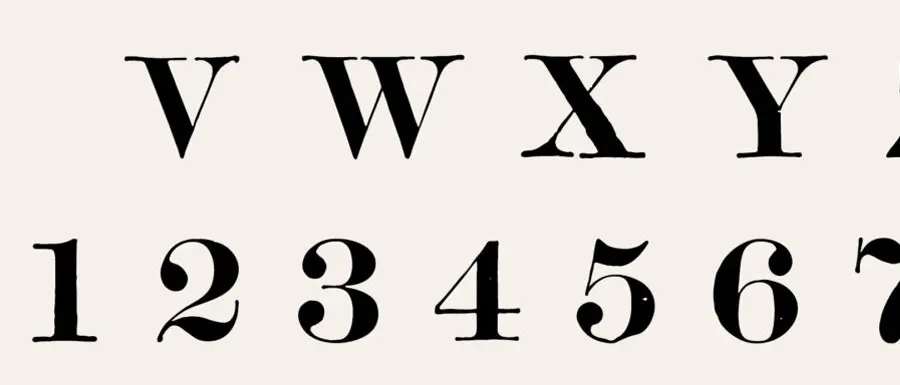
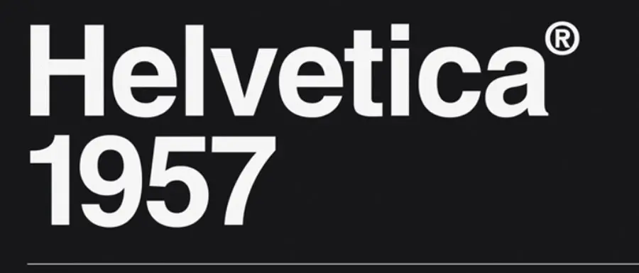
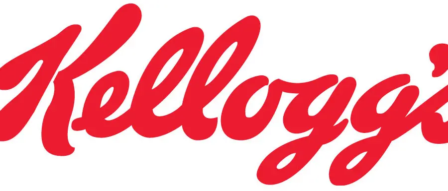
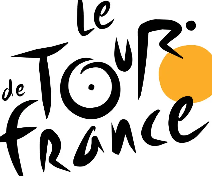
There are 4 main types of fonts
- Serif fonts
- Sans-serif fonts
- Script fonts
- Handwritten fonts


Images & Visuals
Use images that feel aligned with your values and audience. Ensure you have the correct right and use the proper attribution
Good sources for royalty-free images:
Stock photo libraries with natural, human-focused imagery
Unsplash
Pexels
Adobe stock
Illustration libraries for simple graphics
Your own photos
Scans from books in the library
Magazine cutouts
Color: Direction & Harmony
A full palette might evolve over time and absorb new colors, focus on having high contrast. Pick a combination from a catalogue or develop your own with color theory
Start with:
A favorite color
One neutral (light or dark)
One accent
Adobe has great color wheels, relied on by most of my friends
Consistency & Originality
Adding patterns to your designs provides consistency, which can be preferable to originality
It might feel clever to use a variety of disjointed colors, but it likely fails to convey a particular brand
Consider using the same:
Tone
Colors
Language
Layout patterns
This develops into your brand. Consistency makes it so that you would recognize anything associated with Coca-Cola by including a mere color or a particular shape outline
Mark This Module Complete When…
You feel like your brand can be described in simple sentences
You understand who you’re building for
You have a rough visual direction (not a final design)
Commenting is not enabled on this course.